
How to plot your data#
Data visualization is an important step for researchers to present their work.
There are many different libraries for data visualization, such as MatplotLib, bokeh and bqplot
Matplotlib is widely used in many different areas.
Bokeh provides interactive visualization library over large datasets.
Learning Outcomes#
Use matplotlib for simple plotting
Understand matplotlib plot features
Use matplotlib for histogram and heat map
Use bokeh for simple plotting (advanced)
Build an interactive widget with bokeh (advanced)
Requirements#
Confirm you have matplotlib and bokeh installed by typing
conda searchin a command window, and search for matplotlib and bokeh.Install the packages if you couldn’t find them,
conda install matplotlib,conda install bokeh
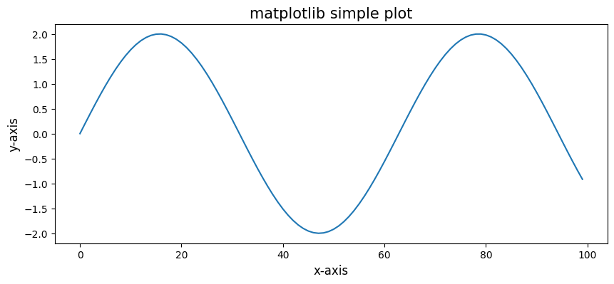
Simple plot example with matplotlib#
### load matplolib and numpy
import matplotlib.pyplot as plt
import numpy as np
x_array = np.arange(0,100)
y_array = 2*np.sin(x_array*0.1)

fig = plt.figure(1,figsize = (10,4))
plt.plot(x_array,y_array)
plt.xlabel('x-axis',fontsize = 12)
plt.ylabel('y-axis',fontsize = 12)
plt.title('matplotlib simple plot',fontsize = 15)
plt.show()

### you can try %pylab inline as the first line of the code, so you don't need to import matplotlib.pyplot and do plt.show()
Understand matplotlib features#
### figure copied from https://matplotlib.org/tutorials/introductory/usage.html#sphx-glr-tutorials-introductory-usage-py
from IPython.display import Image
from IPython.core.display import HTML
Image(url= "https://matplotlib.org/_images/anatomy.png")

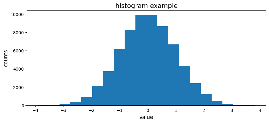
Histogram and Heatmap#
N_points = 2**16
result = np.random.normal(loc = 0.,scale = 1.,size = N_points)

fig = plt.figure(1,figsize = (10,4))
plt.hist(result, bins = 20)
plt.xlabel('value',fontsize = 12)
plt.ylabel('counts',fontsize = 12)
plt.title('histogram example',fontsize = 15)
plt.show()
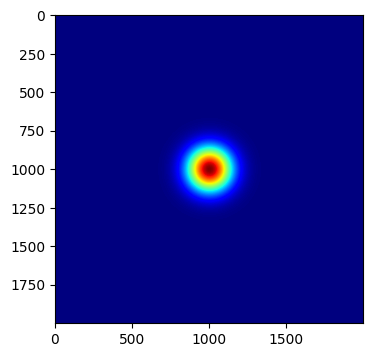
### heat map
import matplotlib.cm as cm ### cmap tables
x = np.arange(-10,10,0.01)
y = np.arange(-10,10,0.01)

xx, yy = np.meshgrid(x, y, sparse = False)

def Gaussian_Beam(x,y,width):
    z = np.exp(-(x)**2/width-(y)**2/width)
    return z

z = Gaussian_Beam(xx,yy,2)

fig = plt.figure(1,figsize = (10,4))
plt.imshow(z,cmap=cm.jet)
plt.show()
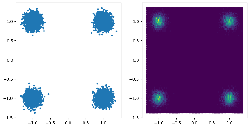
## plotting a constellation diagram two options

s = np.random.choice([1.+1j, -1+1j,1.- 1j,-1 -1j], 10000)
s += np.random.randn(10000)*0.1 + np.random.randn(10000)*0.1j

fig = plt.figure(2, figsize=(10,5))
plt.subplot(121)
plt.plot(s.real, s.imag, '.')
plt.subplot(122)
plt.hexbin(s.real, s.imag)
plt.show()
Advanced layout options#
As shown above matplotlib lets you lay out plots into subplots. This is quite advanced, see below some examples
%matplotlib inline
# using pylab.subplots
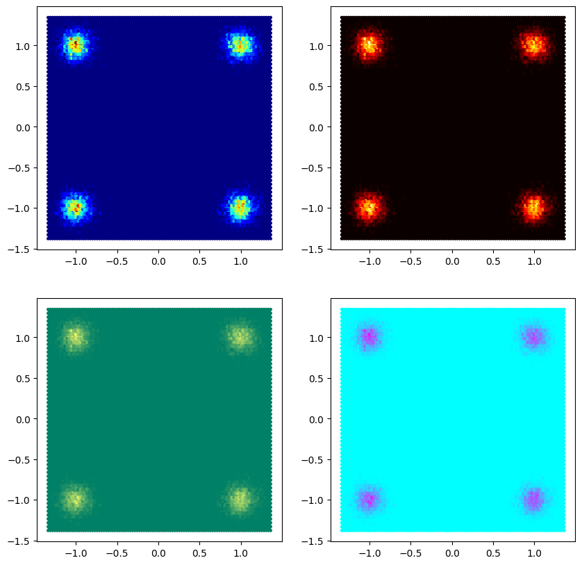
fig, axes = plt.subplots(2,2, figsize=(10,10))
cms = [cm.jet, cm.hot, cm.summer, cm.cool]
k = 0
for i in range(2):
for j in range(2):
axes[i,j].hexbin(s.real, s.imag, cmap=cms[k])
k+=1
plt.show()
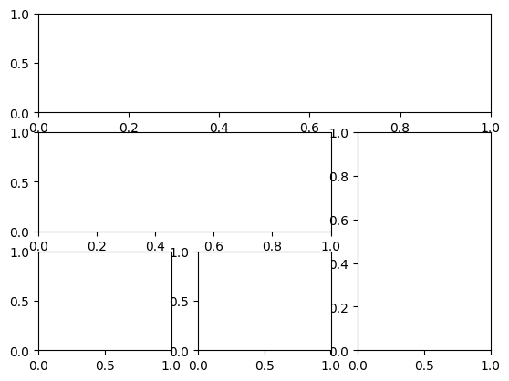
# using subplot2grid even more advanced options are possible
fig = plt.figure()
ax1 = plt.subplot2grid((3, 3), (0, 0), colspan=3)
ax2 = plt.subplot2grid((3, 3), (1, 0), colspan=2)
ax3 = plt.subplot2grid((3, 3), (1, 2), rowspan=2)
ax4 = plt.subplot2grid((3, 3), (2, 0))
ax5 = plt.subplot2grid((3, 3), (2, 1))
plt.show()
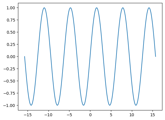
Notebook magic#
There are two ways for plotting with matplotlib in jupyter notebooks. To control which one is used use the %matplotlib magic. The default is %matplotlib inline which does not provide interactivity (zoom, pan, …)
%matplotlib inline
fig = plt.figure()
plt.plot(np.linspace(-5*np.pi, 5*np.pi, 200), np.sin(np.linspace(-5*np.pi, 5*np.pi, 200)))
plt.show()
Interactive matplotlib plots#
If you want to be able to interact with your plots, like e.g. zoom in to look more closely you should use the %matplotlib notebook magic. This will give you an interactive view, which allows you to interact with the graph. You can also change the data for example. Note: Because it allows you interactivity, it will not create a new figure if you just to plt.plot, but instead place the plot into the old figure. So you need to always create figures first.
%matplotlib notebook
fig = plt.figure()
plt.plot(np.linspace(-5*np.pi, 5*np.pi, 200), np.sin(np.linspace(-5*np.pi, 5*np.pi, 200)))
plt.show()
plt.plot(np.linspace(-5*np.pi, 5*np.pi, 200), np.sin(5*np.linspace(-5*np.pi, 5*np.pi, 200)), 'r')
[<matplotlib.lines.Line2D at 0x7573341dfdf0>]
fig=plt.figure()
plt.plot(np.linspace(-5*np.pi, 5*np.pi, 200), np.sin(5*np.linspace(-5*np.pi, 5*np.pi, 200)), 'r')
[<matplotlib.lines.Line2D at 0x7573341a9cf0>]
Bokeh: simple plotting (Supplementary material)#
Another option for plotting is the bokeh module. In contrast to matplotlib, it’s build for interactive web plotting, and is significantly faster for interactive plots with large datasets.
from bokeh.plotting import figure, output_notebook, show ### import necessary functions from bokeh library
output_notebook()

x_array = np.arange(0,100)
y_array = 2*np.sin(x_array*0.1)

p = figure(title = 'bokeh simple plotting',
           x_axis_label = 'x-axis',
           y_axis_label = 'y-axis',
           height = 300,
           width = 600)
p.line(x_array,y_array,line_width = 1.5)

show(p)
Interactive widget with bokeh (Supplementary material)#
You can easily make interactive widgets with bokeh.
from bokeh.models import Column
from bokeh.models.widgets import Slider

slider = Slider(start=0, end=10, value=1, step=.1, title="slider")

show(Column(slider))
You can easily make callbacks to create interactivity using bokeh sliders. Depending on your use case, you can for example access the data using javascript only. That way you could export your notebook, and have interactivity without needing python running on your server.
### we need to combine slider with some other python scripts to show interaction
### for example, slider value change could trigger a sine wave plot
### we need to use callback method via CustomJS to trigger the functions...

from bokeh.layouts import column
from bokeh.models import CustomJS, ColumnDataSource, Slider

x_array = np.arange(0,1000)
y_array = 2*np.sin(x_array*0.1)

source = ColumnDataSource(data=dict(x=x_array, y=y_array))

plot = figure(width=800, height=400)
plot.line('x', 'y', source=source, line_width=3, line_alpha=0.6)

slider = Slider(start=0.1, end=1, value=0.1, step=.1, title="freq")

update_curve = CustomJS(args=dict(source=source, slider=slider), code="""
    var data = source.data;
    var f = slider.value;
    var x = data['x']
    var y = data['y']
    for (var i = 0; i < x.length; i++) {
        y[i] = Math.sin(i*f)
    }

    // necessary because we mutated source.data in-place
    source.change.emit();
""")
slider.js_on_change('value', update_curve)


show(column(slider, plot))
Further reading#
Bokeh or Matplotlib#
Why two plotting libraries, what are the advantages/disadvantages?
Bokeh Advantages#
fast
easy integration in browser
conversion to javascript
interactive widgets/plots without python code
good integration with other “deep learning” packages
pandas
datashader
Bokeh Disadvantages#
customisation limited compared to matplotlib
limited save/export functionality
plotting takes some getting used to
Matplotlib Advantages#
high quality plotting
very customizable
latex labels/text
many export formats
pdf,png,svg,eps,wmf, …
easy (matlab-like) plotting interface
Matplotlib Disadvantages#
slow for fast updating plots
not primarily made for interactive use
Conclusion#
Use matplotlib for:
plots for publications
quick and dirty (throwaway) plotting in notebooks
slow updating interactive applications
Use bokeh for:
interactive web-“applications”
interactive jupyter notebooks
interactive plots with lots of lines/points (webgl backend)
Other libraries#
Arguably the best library for building non-browser based GUI applications is pyqtgraph. Which is an excellent and fast plotting library for integration into QT a cross-platform GUI framework.
Exercises#
matplotlib#
Create two plots next to each other plotting the absolute value squared of a sine wave in the time and frequency domain.
Change the plot of the frequency domain to be on a logarithm scale, without manualy recalculating
At labels to your axes. Your y-axis should show \(|A|^2\), your x-axis should show \(\lambda\) (don’t worry about the fact that it is not in wavelength).
bokeh#
Create a plot with 2 sine waves of different frequencies and with red and green as colors